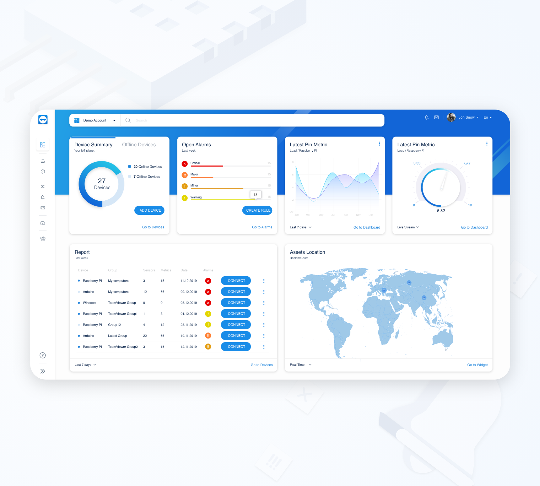
UX Case Study - IOT
Challenge: Redesign IoT Dashboard with new solutions – improve user experience
Deliverables: Strategy, Persona, User Journey Map, Sketches, Wireframing, UI, Prototype.
Role: Product Designer
What is TeamViewer IoT :
TeamViewer IoT enables users to instantly connect, monitor, and operate assets in manufacturing and production – securely, quickly, and across locations.
Challenge
The challenge is to redesign the TeamViewer IoT dashboard and understand users’ response to the current dashboard, discover pain points and propose a solution to improve their experiences.
Process
Before starting any process I do some research to understand who our users (personas) are. Then the journey map with wireframing/Lo-Fi sketches helps me to understand where in the process users may face troubles. At the end, I will validate the process with users and confirm that the pain points are solved by the redesign. This is for projects with a four weeks timeline. Let’s go to view each step deeper.
1. Research / Personas
During research and understanding who our users are I create personas.
John– warehouse owner
Needs and Goals:
John Wants to
- Monitor and operate assets in the warehouse
- Get alert when something goes wrong
- Needs to view all UI important information on one page
2. User Journey Map / User Flow
Based on the research and the old dashboard version I create a User Journey Map / User Flow.
- User actions
- touchpoints
- users pain point
- Defining solutions
3. Wireframing / Lo-Fi Sketches
Based on the established pain points and meetings with the engineering team, I sketch different options to test and see how to initiate minimal changes to optimize the user experience. Throughout the process of sketching and redesign I update my work per their feedback (IoT is technical, that is why I need the engineers’ support). In addition to making design changes, I concentrate on how to improve the user experience of the dashboard
After a few meetings with the team and feedback from the engineers I provide good solutions for all.
4. UX Flow Approval
UX flow approval is to be able to have a final flow which is used as an approved complete template. The most important thing is to have a ready for use UX flow to not affect the UI creativity.
5. UI Designs / Prototype
A Company is preferred to have its UI guide, this helps you to save time and keep the consistency of the design. If a company doesn’t have a UI guide then a time must be specified to create it. This step is very important to avoid the mess that can be created in design.
We apply the UI design on the low-fidelity mockup to have high-fidelity mockups. Then we should create a prototype, and motion design (if the company wants to have an interactive design).
6. User Testing
Test the design from the user perspective to check the right development of the site.
Conclusion
At the end of the four weeks we have the following results:
- Ability to set up a device (the most important part)
- Ability to view the requirements in the overview page – customizable overview page
- Practical alert system


